A2 Media Studies reflective analysis
Question one: In what way does your media product use,
develop or challenge forms and conventions of real media products?
When I was given the brief to ‘I need to create a promotion package for the release of an album, to
include a music promo video…’ my initial idea was not to follow convention and
make sure that the music video, along with the ancillary texts, was alternative
and different from the mainstream genre which I wanted to avoid.
My music video was adapted from brainstorming many
possibilities and alternate routes I could take, I knew that just because I
knew I didn’t want to follow the mainstream genre that this did not mean that
my possibilities were restricted. I came to the main conclusion that my most
preferable outcome would be to produce a video which was similar to an ‘Alice
in Wonderland’ theme, with abstract settings, a female protagonist and things
not being all that they seem at first glance. After finding a song which seemed
suitable for the alternative and abstract video I had in mind ‘Moonlight Sonata
Remix’ produced on the video sharing website ‘Youtube.com’ by an artist called
‘Solarfist’. This is a remix of a classic orchestral piece composed by Ludwig
Van Beethoven, ‘Moonlight Sonata’, and has given the piece an abstract tone
with the use of a drum beat and altering the pitch and altogether sound of the
song.
The video
was now starting to piece together, through the use of the song coupled with
the imagery of an ‘Alice in Wonderland’ and abstract theme, and I knew that the
style of music video I was searching for was a post-modern approach with no
lyrics, and through that no lip-syncing, and now that I knew what I wanted to
do I began to research some similar styled music videos. I began to research
videos such as ‘The Smiths’ music video for their song ‘Panic’, an ex-students,
Euan Baker, music video for the song ‘Friend (Lover)’ by ‘Evenings’, and also ‘You Wish You Were Red’ by
‘Trailer Trash Tracys’. These videos were used to gain audience feedback on the
genre of music videos so I knew how my own project would be received and how I
should approach it. These also gave me inspiration for my video and I used them
to influence my use of lighting and colour tones.


This is a
screenshot from Euan Baker’s music video (LEFT) to show how he gave my music
video (RIGHT) inspiration through the use of black and white, which defies
conventional music videos us of colour, and also the use of the lone single
protagonist. Also, the narrative is shown to be simple, the use of walking through
an unusual forest like terrain.
My music
video highlights post-modern features through its use challenging conventional
music video techniques, such as the lack of performer interacting with the
music, the lack of information given to the audience, which is aided with the
lack of lyrics in the song, and the use of black and white contrasted with a
high saturation of colours as the narrative progresses. The use of
intertexuality is also used within my music video as it is also a convention of
post-modernity. the use of black and white illustrates not only a disengagement
with conventional music video techniques but also it relates to ‘The Wizard of
Oz’ film (1939, directed by Victor Fleming) as when Dorothy is in her home town
Kansas the film is shown to be in sepia tones (relates to the lack of colour/
such as my video with the use of black and white), but then when she enters the
land of ‘Oz’ the colour seems unnaturally bright and highly saturated, just as
my music video does as soon as the character enters the forest. This use of
intertexuality is also shown through the narrative type as the female
protagonist could be seen as similar to the protagonist of the classic ‘Alice
in Wonderland’ novel, Alice. These two very similar and famous
pieces of fiction both show abstract and alternative narratives and they are
what I was aiming on showing with my music video to portray intertexuality and
also the disengagement with conventional music videos.


This is a
screenshot from the 1959 Disney adaptation of ‘Alice in Wonderland’ (LEFT) and
a screenshot of my music video (RIGHT) at the point where both female
characters crawl through a passage to get into an abstract forest full of
wonders, showing how the two relate and how my music video uses post-modern
techniques to follow the abstract or alternative genre.
My media
product, a promotion package
for the release of an album, to include a music promo video rejects the conventional forms of the real media products as the music
video has an abstract use of colour and an unusual narrative which does not
reveal much until the latter third of the music video and also uses post-modern
techniques such as intertexuality to allow the spectator to relate my music
video other pieces of media such as the movie adaptations of ‘Alice in
Wonderland’ (as well as the novel itself) and also ‘The Wizard of Oz’ as both
of these texts, as well as my music video, feature a main female protagonist
who leaves one world which seems mundane and ordinary and then enters an
extremely surreal and abstract world full of unusual colours and evil
antagonists, also female.
Question two: How effective is the combination of your
main product and ancillary texts?
My media text; the music video, and the ancillary
texts; the magazine advertisement for the album and the CD Digipak, are all
effective in achieving their purpose, which is to create a media product that
would appeal to a niche audience who favour alternative music rather than
mainstream pop. Separately they achieve this aim but the combination of all
three together works even better to produce a realistic piece of work which can
cater to the needs of a niche audience, whilst simultaneously fitting together
convincingly. The purpose of catering to a niche audience is that this audience
would favour the sound and the feel of the music rather than what is popular in
the charts for a short time, by doing this I can make the album seem more
successful as it wouldn’t just be a ‘flavour of the month’ and only sell for a
short while before an audience loses interest. The addition of a vinyl gatefold
in the same style as the Cd Digipak (with the loss of the DVD and the addition
of the album advertisement in a poster format) was designed to create a more
unique consumer experience, by giving the consumer an option to purchase a
vinyl version of the album it allows ‘Die-hard
fans’ to feel more connected
to the artist and have a more unique version of an album they love compared to
other fans who have only purchased the CD Digipak. I have included a PowerPoint
presentation I have made on my Blogger which includes information of the rise
of Vinyl and how although it disappeared strongly off of the music scene for a
short time it is being re-vamped by more independent and alternative artists as
a way of separating themselves from mainstream artists who are more concerned
with download figures and statistics rather than distributing their music and
artwork simultaneously.
The main product of this project was the Music video;
this in itself is extremely abstract as and caters strongly to a niche
audience. The use of the strong contrast of black and white and high saturation
throughout the video is not commonly used in conventional music videos. This
coupled with the narrative of the music video creates an abstract video as well
as using many other stylistic methods which have already been explained in
question 1. The music video works well with the two ancillary texts as it
relates using the artistic theme through all three texts as well as avoiding
mainstream music conventions and catering strongly towards a niche audience
instead.
The first ancillary text, the CD Digipak, was designed
to hold a CD for the album and a DVD that included the music video on it, I
originally designed my art work to be put onto a vinyl LP but because it would
have been hard to fit a DVD package on an LP without it looking sloppy I
decided to create a CD Digipak and use the same artwork as the vinyl gatefold I
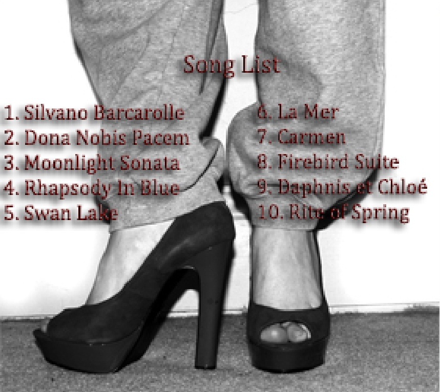
was designing and just save that for an added feature. The two images where
taken by me of a female model (to relate to the female model in the music
video), although it is a little hard to tell seeing as it just her lower legs,
standing in one photograph wearing a posh dress and muddy walking shoes which
is juxtaposed against the second image of worn down jogging bottoms with posh
high heels. These two images are used to signify the coalition of the old style
of classical orchestral music, which is now stereotyped as being associated
with a posh/ higher class society, and the more urban remixed style of music,
commonly stereotyped as being associated with a lower class and poorer part of
society. The main two images used on the front and back cover of the CD Digipak
was edited to be put into black and white, I did this to signify the on-going
theme of back to basics and Originality as by stripping away all the
colour, which would be found in a conventional mainstream CD Digipak, and only
leaving the foundations of the image (which signifies the music) all that is
left is pure talent and music. These images are inverted and used on the
interior of the CD Digipak because I wanted to use these as a metaphor that
even when inverted there is still practically the same image, as a reminder to
the fans that even when the image/ music is altered in an abstract way (as the
music was originally classic pieces of orchestral music that has been remixed)
it is still the same, in the sense that it is still good. The image that has
been used twice, reversed the second time, for the backgrounds of the CD and
DVD holders was designed to create an abstract yet artistic feel to the CD
Digipak which the images also tried to portray.
The other ancillary text, the imaginary album
advertisement, designed to be featured in a music magazine, goes against the
usual convention of music album advertisements as; firstly it is a double page
image which is rare and very alternative compared to the mainstream single page
advertisements, secondly the advertisement has little information on the page
and only includes the artists name (SteamPunk) and the album name
(Originality), this goes against convention as usually an album advertisement
would include information such as release date and star ratings or comments
from music critics or magazines, I chose to ignore these conventions as this
advertisement was designed to tease an audience who would already know of
SteamPunk and excite them to find out more information of the album elsewhere,
and also to intrigue potential consumers who might not of heard of the artist
and want to find out more. The enigmatic theme of the advertisement is one of
the most valuable assets to the artist and independent record label as it would
not have enough money to create advertisements on billboards or other places
which might be very expensive to create and produce, whilst paying for two
pages in a magazine may be expensive it would be worth paying for it if it
meant that the advertisement would attract attention and audiences without
having to pay more for other mediums of the media to advertise it.
Question three: What have you learned from your
audience feedback?
The audience feedback I originally received was from
three separate individuals with different psychographic and
demographic qualities, they all watched the same three videos of other
alternative music videos and told me how they felt about them and why the
either liked or disliked them, as well as what they liked and disliked. The
verdict of these responses is that they all liked the artistic qualities held
by the videos and the favourite out of the three was a student-made abstract
video which inspired my work this year, each response stated that they liked
the use of editing and black and white in the video and thought that although
it lacked a strong and obvious narrative it was still a great piece of work.
This unanimous response is what inspired me to take a leap in the direction of
the music video I have finally created, it uses themes from all three music
videos such as; the use of black and white, the use of high saturated colour,
non-lip synced performance, abstract music video, and alternative music. After
I followed these responses and made my music video, with the alternative genre
in mind, I then conducted a similar survey – by asking a class full of people
and then asking five of them for their response, through a questionnaire – this
allowed me to know if I have completed what I set out, in creating an
alternative music video aimed at a niche audience. The response I got confirmed
what I set out to do and some of the responses brought some un-expected results;
out of the five people asked if they liked the music video, four of which
confirmed that they did, one person did not. The one person who did not enjoy
the music video confirmed that she is a fan of mainstream rock music, whose
preferred music video format is narrative. My video has narrative elements but
is mainly alternative and abstract; this response was not a negative as it confirmed
that my music video is not for a mainstream audience but instead a niche one. The
surprising results from the survey is that – aside from the one person who did
not like it – three out of the remaining four members of the audience also
aligned themselves with a mainstream audience, showing how because of factors
like the elements of narrative, the video reached out to a wider audience. None
of the members of the audience asked to fill in the questionnaire declared that
their favourite genre of music was alternative – although one answered with
indie – or even classical or orchestral music, but four of them still admitted
to liking my music video, this shows how it branches out to a wider audience
outside of the genre and music video style.
Overall I have learnt that the music video I have
created got an 80% positive response rating among an audience of 5, with varied
musical tastes and styles. I have achieved what I set out to do, by appealing
to a niche audience rather than mainstream, but I have also attracted some
members of the mainstream audience to the video, achieving more than what I set
out to accomplish, as this would not diminish the overall style or sales of the
music video but gain more followers to the artist and the genre.
Question four: How
did you use new media technologies in the construction and research, planning
and evaluation stages?
New media technology has been absolutely essential in creating my media product, access to the internet was essential to researching media products similar to mine and finding the song which I finally used for the music video. The use of the program ‘Audacity’ allowed me to record the chosen song off of the video sharing website ‘Youtube.com’, with the owner’s permission, was essential in allowing me to have my own copy of the song which would later be uploaded onto ‘adobe premiere pro’ and then used to piece together with the video. ‘Youtube.com’ became the most essential part of the construction of this process as it allowed me to watch the videos which I have used as inspiration and then most importantly upload my raw footage and finished product of my music video which I then uploaded on to ‘Blogger’. ‘Blogger’ was an extremely useful website which allowed me to keep a recorded log of all my ideas and progress, this not only allowed me to review my work but also teachers who could view this at their own discretion and give me constructive feedback and track my progress. The combination of photo editing software such as ‘adobe Photoshop’ and video editing software such as ‘adobe premiere pro’ were used not only to piece together my raw footage into a linear chronology but also to enhance its colour and contrast. The use of ‘adobe Photoshop’ allowed me to create images which were used in the music video, the flashing negatives shown in sections of the music video.


This is an
example of how media technology was used in my music video as ‘Photoshop’ was
used to create this sequence of events. The image furthest left was the
original image which then was turned black and white (MIDDLE) and then negative
(RIGHT) and was shown for a bit less than a second each in the music video to
give an abstract flashing effect.
‘Abobe
Premiere Pro’ was used when I began to upload my raw footage and then to edit
it. As I used a HD camera, vital in capturing good quality footage, that
captured the footage onto tape, this was then uploaded onto a computer via
‘Adobe Premiere Pro’ and then the editing progress began. The first thing that
I needed to do was to order the footage taken on the camera into the proper
chronology, as some shots were recorded before others that may have come before
them on the storyboard. After the shots were put into the correct chronology I
then began to cut down the clips to a proper length so that the music video
flowed smoothly from one shot to the next creating a realistic narrative
without errors in continuity or unnecessarily long shots. After this I began to
create the effects which make the video abstract, such as the reverse effect
put on the shot were the leaves seem to appear to fly from the ground into the
character’s hands(1) and,
most importantly, the colour changes from black and white to highly saturated
throughout the sequence.
Directory
1.